Case Study: Creating a fresh look for a consumer catalog
FXR Spring 2021 Catalog
FXR is an international snow-wear, motocross, and lifestyle brand. Leading into the 2021 Spring season there was a transition of designers and the senior management team was looking to myself to develop a new layout that would stand out and present a cleaner final product for the consumer.

-
Leading into my role as graphic designer at FXR I took it upon myself to redo the catalog layout and create a new consumer catalog from scratch for the Spring 2021 line.
Previous catalogs had felt inconsistent in look and feel and felt congested with product.
My goal was to address these issues and create a catalog that featured beautiful photography and a consistent layout that was easy to navigate.
-
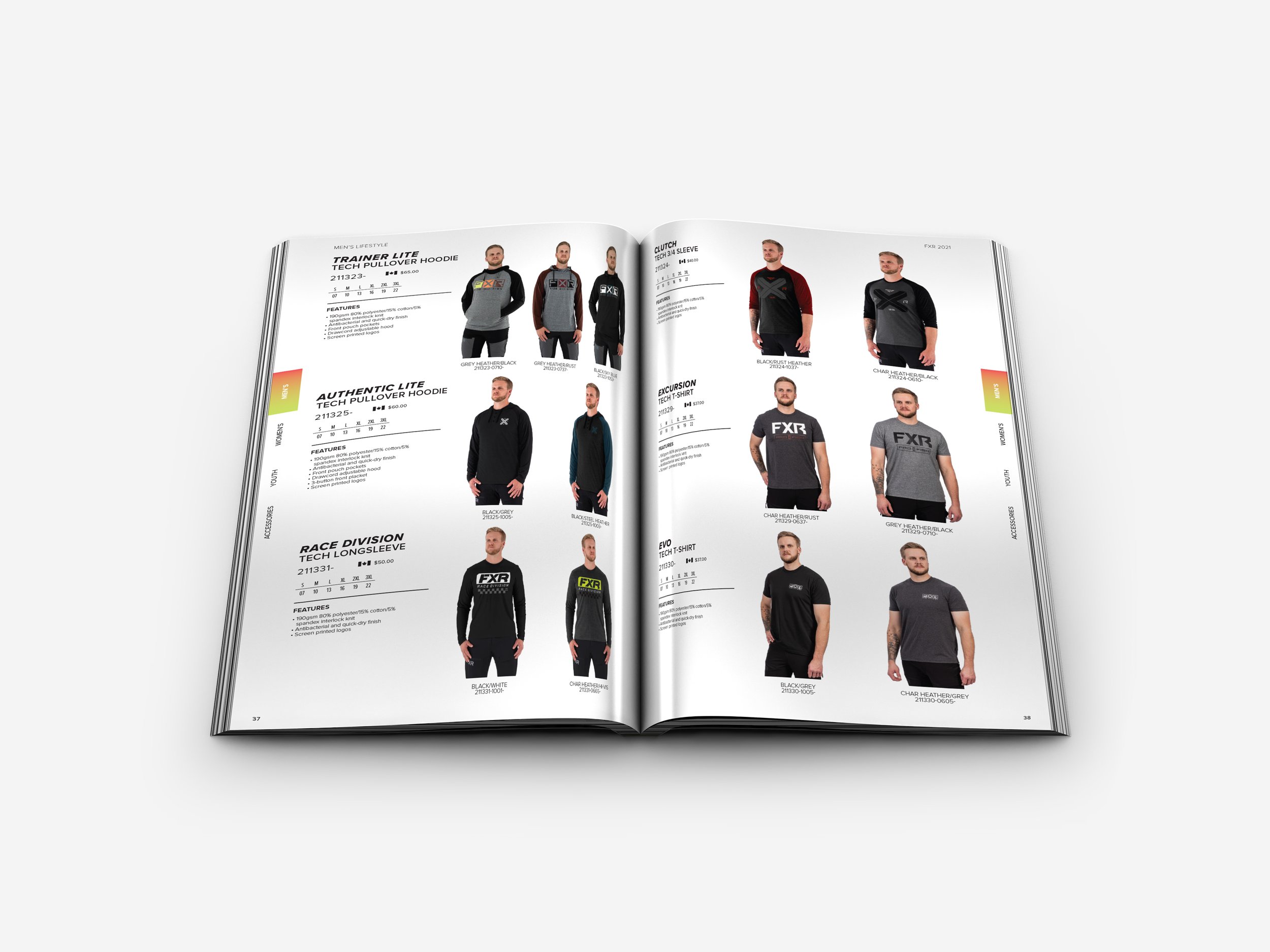
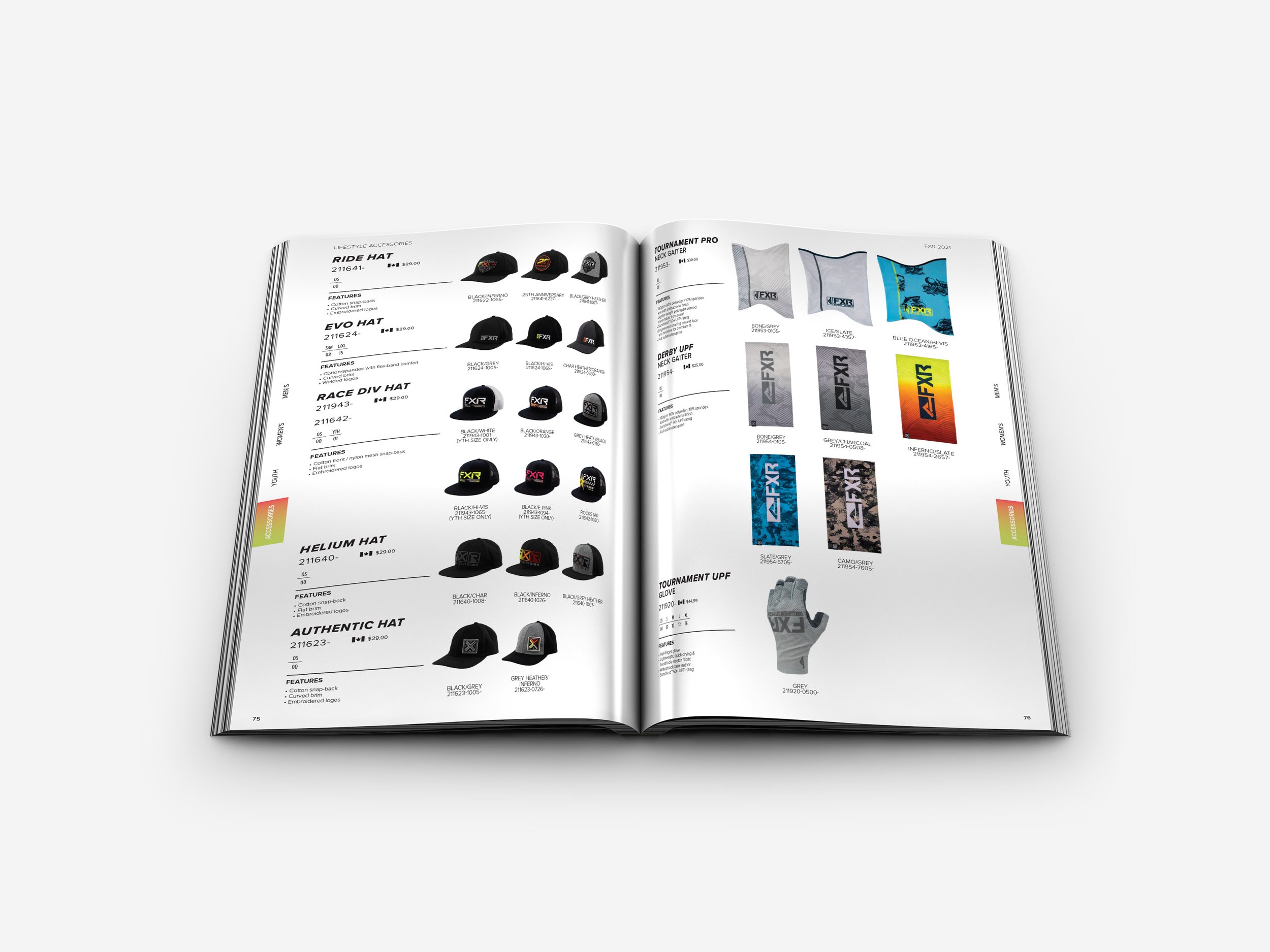
To achieve the goals set out I first created a layout that would serve the product and be easy to navigate for a consumer. This included having 3,4,or 5 products on a page all displayed and layed out in the same manner so consumers could easily identify sizes, features, and price.
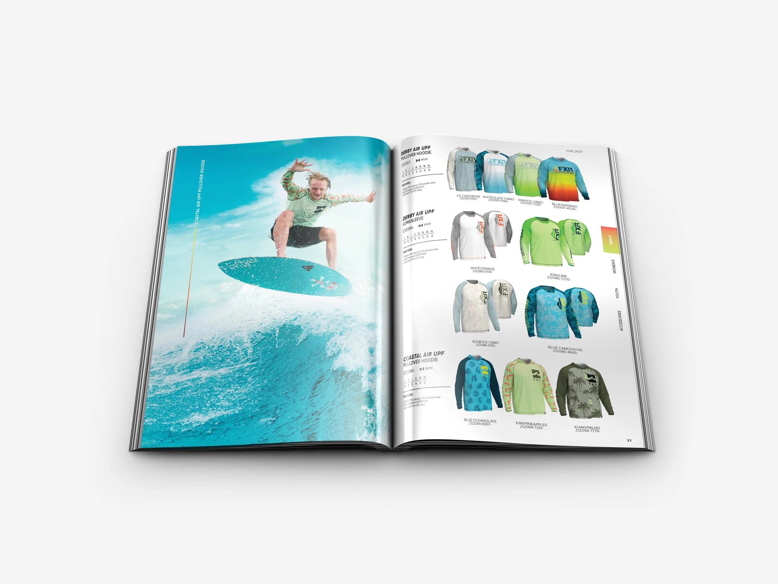
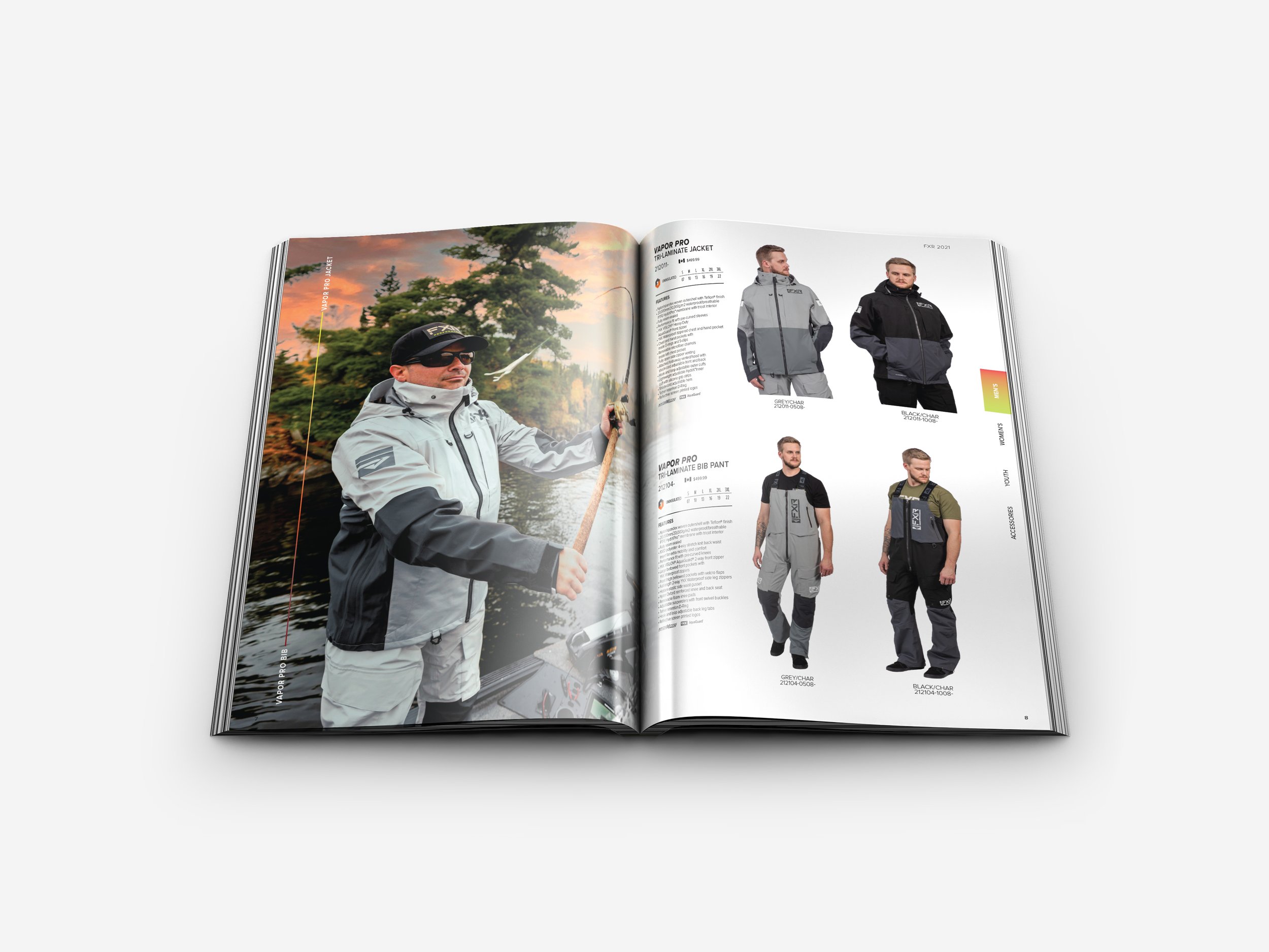
Next I worked with photos from a number of different photoshoots from different photographers. I used photo manipulation techniques to use some otherwise unusable photography and edited the photos to feel cohesive to the project.
Finally I combined the layout and photos in a way that felt natural and featured beautiful photography spreads without taking away from the consumer experience of shopping in the catalog.
-
The catalog was well received from senior management and a large run was distributed to FXR’s retailers and sellers as well as used at trade shows to help sell the product and increase brand visibility.
Creating Consistency.
For this project I wanted to rework the way product was being layed out. In the past each page was different and worked around making room for the product whereas with this I wanted to create a layout that would work with 3, 4, or 5 scu’s being displayed per a page. This way each page in the catalog would look and feel the same way and be easy to navigate for a consumer.
Making it pop.
I wanted to create images that really stood out and felt more like a lookbook than a catalog. To achieve this I had to teach myself photo manipulation techniques and rework photos that would otherwise be unusable or not satisfactory for the level of quality I was after. I managed to create beautiful spreads that worked within the pages that product was being displayed on creating somewhat of a lookbook/catalog hybrid.


